Brand & Design Guidelines
The Faces & Voices of Recovery identity system and the standards for its application are carefully designed to establish a strong, consistent, and memorable presence in the marketplace.
Use This Guide to keep
Brand Consistent
These Brand Guidelines serve as a comprehensive resource to ensure that our identity is used correctly across all media and communications. Adhering to these guidelines is essential in preserving the integrity of the Faces & Voices of Recovery brand. Any inconsistent or improper representation can diminish the power and recognition of our identity.
These guidelines balance both rigidity and flexibility. While it’s impractical to cover every possible use case, the most common and practical applications are detailed here. These guidelines provide a framework that allows for creative expression, while still maintaining a unified and consistent brand experience.
Certain elements of our identity, however, must not be altered or compromised. Our communication must always meet the highest standards of quality to reflect the mission and values of Faces & Voices of Recovery. Proper usage of our identity will not only ensure effective communication but will also foster a positive reputation for the brand.

The Faces & Voices of Recovery logo has been designed to be dynamic, active, and instantly recognizable. The all-caps and bold typography represent strength, while the rounded forms provide a sense of approachability and inclusivity. The font is specifically selected for maximum legibility to ensure the three most critical elements of our name—Faces, Voices, and Recovery—are always emphasized.
The logomark (symbol) represents advocacy in motion, symbolizing the global movement for recovery. It is inspired by sound waves and longitudinal lines found on a globe, but the abstract rendering also evokes diversity, action, and growth.

Tagline
Our tagline, “Advocate. Act. Advance.“, encapsulates our core mission and purpose. It is both multi-dimensional and balanced, mirroring the journey of recovery itself.
- In Print Applications: Use the complete tagline whenever possible. This reinforces the full scope of our efforts—advocating for recovery, acting in support, and advancing the cause.
- In Text Applications: It can also be used selectively. For example, one part of the tagline—“Act.”—can be employed as a focal point in advertisements or messages, depending on the context.
The tagline is also a call to action to the global recovery community, urging individuals to advocate, act, and advance.
Tagline Use
The tagline is best used “locked-up” with the logo, appearing directly beneath it. The tagline should follow the clearspace guidelines to ensure that it remains legible and doesn’t compete with other elements. When placed on a dark background, the tagline should be reversed out in white.
When the tagline appears independently, a minimum clearspace of 0.25 inches around all sides is required.
Logo and Tagline Lockup:
- The tagline is centered underneath the full name and positioned at the distance beneath the type shown here, which is the same in both the vertical and horizontal orientations.
- The tagline typeface is Brandon Grotesque Medium.
- Tagline color is Faces & Voices of Recovery Blue 3.

Whenever possible the Faces & Voices of Recovery logo should appear as the color version on white. However, there will be instances when reproduction limitations will not allow for the primary logo to be reproduced effectively. A black logo is allowed when media reproduction is one color.
We have two options for one-color logos. The first is 100% black. The second is made up of tints of black (values shown to the right) which is still considered a one color logo.
The tagline is also black in the one-color version.

Use only the approved electronic artwork. Never alter, add to, or re-draw the logo in any way.
Primary (Horizontal): The horizontal logo is the primary configuration, with the logomark positioned to the left of the name. This version should be used wherever space allows. It can appear with or without the tagline.
Secondary (Stacked): The stacked logo is an alternative for tighter spaces or when the horizontal layout cannot be accommodated. This version places the logomark above the name and, like the horizontal version, can appear with or without the tagline.
Logomark Only: The logomark can be used in certain situations but should be deployed sparingly, especially in the initial phases of brand rollout. The connection between the symbol and the Faces & Voices of Recovery brand must be strongly established before this form becomes widespread.

The color logo can appear on solid-colored light backgrounds. It should primarily be used on a white background. Use the full-color logo on backgrounds that are light enough to allow all of the logo colors to be seen clearly. For darker backgrounds, use the reversed-out version of the logo as shown on page 15. These guidelines apply to all orientations of the logo.

Reversed-OUT Logo
When using the logo on dark colors, use the approved reversed-out version of the logo as shown on this page. All type, including the tagline, will be in white. These guidelines apply to all orientations of the logo.
We have an alternative reversed version of the logo that is built from transparent whites (shown below). When placed on top of any color or image, this logo file will produce the different shades of the mark.
On social media platforms, it is often more practical to use the logomark or the logo without the tagline. This optimizes space while maintaining recognition.
To maintain brand integrity, never alter or distort the logo. This includes:
- Stretching or squashing the logo
- Changing the color scheme
- Adding or removing elements
- Using outdated logo versions
- Overlaying the logo on inappropriate backgrounds (e.g., highly textured or busy patterns)
For reference, examples of incorrect logo usage are provided in the original document, but these are not exhaustive. Always ensure that the logo maintains its clarity and recognizability.
In an attempt to avoid common mistakes when using the Faces & Voices of Recovery logo, several examples of incorrect usage are displayed here for reference. These variations are representative, however, not all-inclusive.

Logo Typeface
The Faces & Voices of Recovery logotype is set in Brandon Grotesque Bold. Do not, under any circumstances, substitute another typeface for the logotype, or attempt to redraw the logo.
Do not alter the letter spacing under any circumstances. Also, do not alter, distort, condense, expand, or italicize the typeface.
Do not use our logo typeface for anything other than the logo and tagline.
Our Name in Text
Anywhere our name appears in text it will be treated as a proper noun as shown to the right.
Never use our logo as part of a sentence.
See what ![]() can do for you.
can do for you.
How Faces & Voices of Recovery should always appear in text:
The Faces & Voices of Recovery or Faces & Voices identity system and the standards for its application are designed to create a strong and memorable position in the marketplace. These Brand Guidelines will help you to use our identity and image properly and consistently. Inconsistent representation of the Faces & Voices of Recovery identity could erode the integrity of our brand.
Clear Space
To ensure the logo’s visibility and prominence, maintain a minimum clearspace around it. The clearspace should be equal to the height of the logomark (symbol), ensuring the logo is not crowded by competing graphic elements such as text or background patterns.

Minimum Size
The minimum size of the primary logo is 1 inch wide for print materials and 72 pixels wide for digital applications (e.g., websites, videos). For the secondary logo, the minimum size is 0.75 inches or 54 pixels wide.

Primary Colors
Our primary color palette consists of five shades of blue, ranging from light to dark. Blue symbolizes trust, wisdom, calmness, and loyalty, aligning with the values we represent.
Printing with PANTONE® inks is the desired method of production, but it is not always cost-effective. Accordingly, process (CMYK) and multimedia (RGB and Hexadecimal) equivalents have been provided. Colors will always shift depending on the medium (on-screen vs. printing on paper vs. embroidery, etc.). These formulas (or profiles) are provided for the different mediums to alleviate color shifting as much as possible. However, there will always be discrepancies.
|
Color | Accessibility |
Pantone (PMS) |
Process (CMYK) |
Digital (RGB) |
|---|---|---|---|
|
#4197cb |
PMS 7688 C |
71, 28, 4, 0 |
65, 151, 203 |
|
#238dc1 |
PMS 7689 C |
79, 33, 7, 0 |
35, 141, 193 |
|
#0075a9 |
PMS 7690 C |
93, 47, 15, 1 |
0, 117, 169 |
|
#005487 |
PMS 7692 C |
100, 69, 24, 7 |
0, 84, 135 |
|
#00416b |
PMS 7694 C |
100, 77, 34, 21 |
0, 65, 107 |
Secondary Colors
|
Color | Accessibility |
Pantone (PMS) |
Process (CMYK) |
Digital (RGB) |
Usage |
|---|---|---|---|---|
|
Black |
PMS 447 C |
72, 66, 65, 76 |
19, 19, 19 | |
|
#f4f4f4 |
0, 0, 0, 4 |
244, 244, 244 | ||
|
#A86531 |
PMS 7566 C |
0, 40, 71, 74 |
168, 101, 49 |
NRI |
|
#E8AC30 |
PMS 143 C |
0, 26, 79, 9 |
232, 172, 49 |
Podcast |
|
#797A1B |
PMS 7496 C |
1, 0, 78, 52 |
121, 122, 27 |
RDP |
|
#BFBA41 |
PMS 7751 C |
0, 3, 66, 25 |
191, 186, 65 |
#BFBA41 |
|
#69192B |
PMS 7421 C |
0, 76, 59, 59 |
105, 25, 43 |
Events, CAPRSS, RLS |
|
#C9474F |
0, 65, 61, 21 |
201, 71, 79 |
Memberships | |
|
#557D7D |
PMS 7475 C |
32, 0, 0, 51 |
85, 125, 125 |
Trainings |
|
#8dC2C3 |
PMS 550 C |
28, 1, 0, 24 |
140, 192, 194 | |
|
#4C3181 |
PMS 268 C |
41, 62, 0, 49 |
77, 49, 130 |
ARCO |
|
#8267B5 |
28, 43, 0, 29 |
130, 103, 181 |
Advocacy |
Consistent use of color will help build strong brand recognition. It is possible for an organization to “own” certain colors, by leaving a lasting impression through identification of the organization with a specific color palette.
Using primary and secondary colors as background block and testing with white, black and 5 #2A4469(blue) as text color the following will pass.
Primary Typeface:
The primary corporate typeface for all communications is Open Sans, a highly legible sans-serif typeface. It provides a range of weights and styles to support a variety of textual elements.
Secondary Typeface:
When Open Sans is unavailable (e.g., in emails or certain document formats), use Verdana, which is commonly installed on most systems.
Seasonal Corporate Typeface:
Script Font: Evalfey Variable
Typeface Guidelines:
- Open Sans Regular: For body text and large paragraphs.
- Open Sans Semibold or Bold: For subheadings, bullet points, and emphasis.
- Verdana: For fallback usage when Open Sans is not available.
- Evalfey Variable: Script font used seasonally when a script is needed.
- Above The Beyond: Font used for signature on graphics.
Open Sans Light
ABCDEFGHIJKLMNOPQRSTUVWXYZ
abcdefghijklmnopqrstuvwxyz | 1234567890
Open Sans Light Italic
ABCDEFGHIJKLMNOPQRSTUVWXYZ
abcdefghijklmnopqrstuvwxyz | 1234567890
Open Sans Regular
ABCDEFGHIJKLMNOPQRSTUVWXYZ
abcdefghijklmnopqrstuvwxyz | 1234567890
Open Sans Italic
ABCDEFGHIJKLMNOPQRSTUVWXYZ
abcdefghijklmnopqrstuvwxyz | 1234567890
Open Sans Semibold
ABCDEFGHIJKLMNOPQRSTUVWXYZ
abcdefghijklmnopqrstuvwxyz | 1234567890
Open Sans Semibold Italic
ABCDEFGHIJKLMNOPQRSTUVWXYZ
abcdefghijklmnopqrstuvwxyz | 1234567890</
Open Sans Bold
ABCDEFGHIJKLMNOPQRSTUVWXYZ
abcdefghijklmnopqrstuvwxyz | 1234567890
Open Sans Bold Italic
ABCDEFGHIJKLMNOPQRSTUVWXYZ
abcdefghijklmnopqrstuvwxyz | 1234567890
- Click on the Open-Sans-Font link (below) to start downloading.
- Find the downloaded file in the downloads folder or your default downloads location and double-click on the file to unzip it.
- Open Font Book App: CMD-spacebar on the keyboard or go to find, top right search icon
 and type: Font Book. Select the program in the search and open the program.
 - Select the main folders from the zip folder that was previously opened in the window and drag and drop it to the Font Book app.
- A pop-up will appear and click Install or replace (if this is the option), repeat this step until all fonts are installed or until the pop-up disappears and you see the three font families installed in the font book app.
- Close all windows and move the downloaded folder and zip file to the trash.
There are three-letters in use:
- Faces & Voices of Recovery
- ARCO
- CAPRSS
Working with the Template
Open on desktop app
- display issues on web version
Save to SharePoint or upload after saving to desktop (try to avoid multiple files in multiple locations)
Use one text box on slides
- Convert text box to 2 columns if needed
- Select the text box > shape format menu > open format pane > shape options tab > text box dropdown > columns button > 2 columns spacing 0.25”
Avoid one word on on last line by applying a soft return to wrap down two words
- Place mouse courser on on start of word to wrap > hold shift and press return
Check Accessibility
- Review tab > check accessibility button
Clear all Formatting to default to template settings
- Select all text inside textbox > Home > Clear all Format
Available Slides on template:
4 Title/Open slides:

3 Divider slides:

3 Content slides:

2 end/Close slides:

Accessibility
Add file Meta Data
- File > Properties
- Fill out the summary section
Check the overall Accessibility of the PPT deck
- Review tab > check accessibility button
- If multiple text boxes are used place text boxes in reading order using
Selection Pane
- Review > check accessibility drown down > Select Pane
- Place the elements in opposite order: the item placed at the bottom will be read first and item on top will be read last. In Reading Order Pane it is the opposite of Selection Pane.
- Table also need to be accessible by defining the header row and text rows
Add alt text to all images inserted to all presentation
- Click on the image > shape format > alt text
- Give credit to photographer
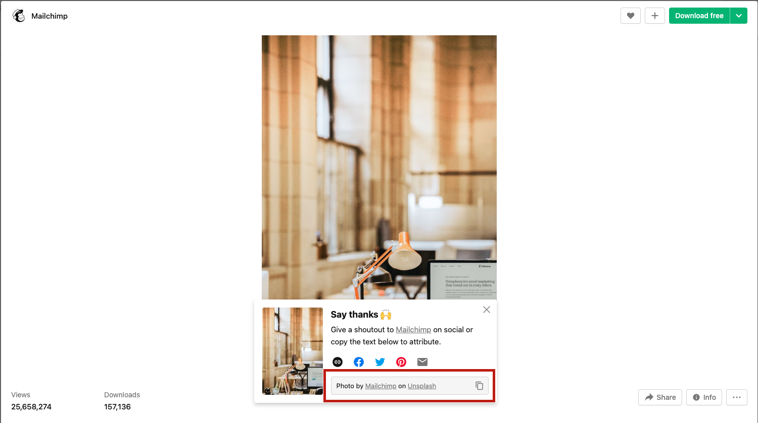
- Add the following credit line to images: “Photo by (photographer) on (website it was downloaded from)”
- Most free sites give you this credit line to copy and past if not follow the above structure, preferred hyperlinked if not that is ok too

Example of Credit line from free site:
Where to search for images
FREE:
https://unsplash.com/
https://www.pexels.com/search/pixabay/
https://nappy.co/
https://commons.wikimedia.org/wiki/Category:Images
PPT insert image option
Purchase:
https://stock.adobe.com/
Final Check list to follow before submitting to Marketing for review
- Name Convention
- When copy and Paste double check all text boxes for correct font
- Verdana minimum 18pt
- One text box per slide (if possible)
- Check Accessibility
- Add Alt-text to images
- Tables have a header row defined under table design
- Double check fonts on all slides
- Remove any black slides from the template deck not being used
- Remove the section titles
- Right click on section title remove all
- FREE accessibility online training: https://www.section508.gov/training-home/#Onlinetraining
- Section 508 Awareness
- MS Word & Accessibility Best Practices
- Training Videos
- MS Word
- How to Author
- Test MS PowerPoint Presentations for Accessibility
*** Get Permission to Post ***
Basic Content
- Images or Videos
- 3 minimum
Event Information Needed
- Name of person in picture
- The represented org
- Event name/title
- Location of event
Influencer-Level Content
- Take a boomerang
- Start a live stream
- Get a business card
- Get social media handles
Content Examples
Good
- A pic of our booth after setup
Better
- A pic of staff at our booth
Best
- A pic of staff & non-staff chatting
Quick Tips
Have fun & get creative!
- Ex: Beautiful setting/scenery
- Ex: Candid moments to humanize staff members
Handles/Hashtags
#facesandvoices
#advocate4recovery
#RecoveryCommunity
#addictionrecovery
#wellness
Steps to be successful in posting event images to social media
- Tell us event details at weekly staff meeting
- Take photos/videos at the event
- Upload with details to Event Images in Slack
- Marketing team creates the online post
Web Image Specs
Hero images: 2400px X 1200px @ 72ppi
Featured images for events: 2800px X 800px @ 72ppi
In the News posts: 2400px X 1600px @ 72ppi
Headshots: 1200px X 1200px @ 72ppi
! add alt text to all images; alt text is the description of what is happening in the image i.g: people in group talking, ARCO logo, etc. !
Social Media Graphic Specs
All social Media: 1080px X 1080px
- If exporting from Canva or Adobe Express, export 2x the quality 2160px X 2160px to prevent pixelation
- Social media sites have a compressor built in which will compress too much if exported at 1x vs 2x the quality
- If exporting as jpg quality set to 100%
Feed Sizes
Instagram Post: 1080×1350 (new size since 2025)
Facebook Post: 1080 x 1080
Instagram/Facebook Story/Reel: 1080 x 1920
Text Leading
Add 1.3-1.5 line spacing if lines on paragraph seem too close to each other.
Facebook Event Cover
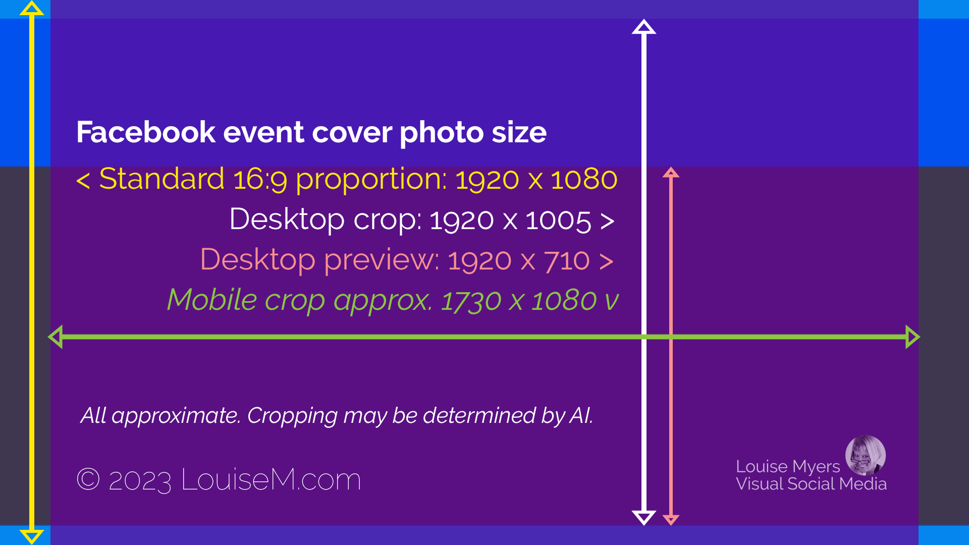
Standard 16:9: 1920 x 1080
Desktop Crop: 1920 x 1005
Desktop preview: 1920 x 710
Mobile Crop approx. 1730 x 1080 (vertical)
Facebook Cover (not an event)
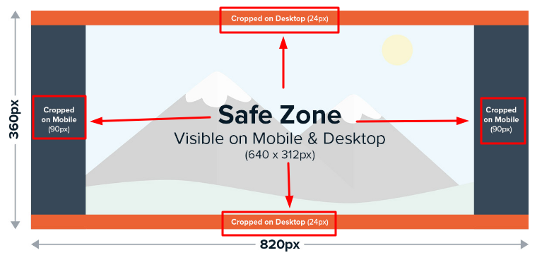
Standard: 1640 x 720 (820×360)
Desktop crop: 1640 x 624 (820 x 312)
Mobile crop: 1280 x 720 (640 x 360)
Facebook Group Cover: 1640 x 858px
Cover size: 1500 x 500
Podcast
Cover Size: 3000 x 3000
Flyer
8.5 x 11 (letter size, If printed and does not need accessibility)
Blog Post
Cover Size: 2400 x 1600
#facesandvoices
#advocate4recovery
#RecoveryCommunity
#addictionrecovery
#wellness
25+ Sites for Free Images
Article taken from Buffer, read full article by Alfred Lua, Former Product marketer at Buffer.
Free image terms FAQ
The following terms will come up often as we discuss free image sources. Read over the terms and conditions of each site you try so you know exactly when and what type of attribution is required.
What is Creative Commons?
Creative Commons is a nonprofit organization that enables the sharing and use of creativity and knowledge through free legal tools. Various types of Creative Commons licenses range from allowing any type of use with no attribution to allowing only certain uses and no changes.
What is the public domain?
Works in the public domain are those whose copyrights have expired, have been forfeited, or are inapplicable. Finding something online does not mean it is in the public domain.
What is royalty-free?
Royalty-free images aren’t necessarily free. In most cases, you’ll have to pay a one-time fee to obtain the rights to use the image. Then you can use it as many times as you like. The “free” in “royalty-free” only means that you do not have to pay royalties to the owner of the image every time you use it. For a comprehensive read on royalty-free images, check out this guide.
Do I need to give credit?
Yes, remember to source your findings, use the following line:
Photo by (photographer/account + embed link) on (website + embed link)
- Unsplash has its own license, which essentially lets you use the images for free, in any way you like (except for using them to create a competing website). The site is powered by a community of almost 300,000 photographers, from hobbyists to pros, who ‘gift’ their photos to make them freely available under Unsplash’s “do-whatever-you-want” with the images license. Unsplash, which is owned by Getty, is particularly great for finding really high-quality images: their team hand-selects every photo and, according to the site, “accept only the best.”
- Burst is a free stock photo platform for entrepreneurs by Shopify. As is the case with Unsplash, the photos are contributed by photographers “with the expectation that users will be able to download, edit and use them however they see fit.” Attribution (giving the photographers credit) is not required but, as Burst puts it “our photographers always appreciate a shout out.”
- Pexels operates along the same lines as Unsplash and Burst, where images are supplied by the photographers themselves. Pexels also has its own license, which states what you can and cannot do with the images. You can use and modify the images for free for both commercial and personal use without attribution.
- Pixabay images are licensed under Creative Commons Zero (CC0), which means you can use them without asking for permission or giving credit to the artist (though it’s always appreciated). Pixabay provides a gentle reminder to check that the content depicted in the images doesn’t infringe on any rights. Pixabay also offers more content formats, from illustrations to sound effects.
- Free Images provides over 300,000 free stock images under its own license. The license allows a very broad range of uses, though it does list several restricted use cases (which are quite common for most free image sites).
- Kaboompics uses its own license, which is similar to Creative Commons Zero except that you cannot redistribute its photos. There are two things that I love about Kaboompics: one, it allows me to search by color, and two, it provides a complementary palette of colors in the photo.
- Stocksnap.io uses the Creative Commons CC0 license, so its photos are free to download, edit, and use for commercial and non-commercial projects.
- Canva is a non-photographer’s answer to Photoshop. The online graphic design tool also offers a library of millions of free and premium stock photos, all under their content license agreement. One advantage of using Canva is that you can quickly turn an image into a custom graphic to use on social media or your blog. You can access Canva’s library of images by using the search function in the editor or heading over to Canva Photos.
- Life of Pix lists free high-resolution photographs and videos with no copyright restrictions for both personal and commercial use. Life of Pix partners with Adobe Stock for more (paid) stock photographs.
- Gratisography: If you’re looking for something a little offbeat, Gratisography should be your first port of call. It also has its own free photo license, which lets you do “almost anything you can think of. While they have a rather limited number of images now, they are high-quality and completely different from any photos you’ll find on the other sites on this list.
- Vecteezy offers more than 10 million free and royalty-free images, and it’s not only photos you’ll find on the site. It’s also a great place to hunt for things like PSDs, vectors, videos, and templates — particularly useful if you’re looking to design something of your own with a stock image as a base. The site offers added protection for users by ensuring they only offer images of people and places that come with a signed model by the photographer and the model — and you can sidestep that issue entirely if you opt for one of their AI-generated images. Vecteezy also has a simple, helpful advanced search function. It will allow you to filter your search by content type (things like PNGs, PSDs, vectors, and videos) — useful if you’re looking to edit the image yourself), license type, and even those generated by (or not generated by) AI.
- Flickr is an image hosting platform where you can find images that can be used and modified for commercial purposes. This doesn’t apply to all the images on the site though, so you’ll need to make sure you filter your searches. To do so, select “Any license” and then “Commercial use allowed” after performing your search. Remember to check the license for each image as they vary.
- The Jopwell Collection by Jopwell: “It’s hard to be what you can’t see,” is a common refrain at Jopwell, a company who have made it their mission to improve workplace diversity. BROUGHT TO YOU BY: Publish Flawlessly. Analyze Effortlessly. Engage Authentically. Buffer is the all-you-need social media toolkit that lets you focus on doing what you love for your business. Get started for free now One of their initiatives is The Jopwell Collection, which they describe as “an album of more than 100 free-to-download stock photos featuring leaders in the Jopwell community – social entrepreneurs, editors, techies, financial analysts, recruiters, marketers, student leaders, and even an Olympian – at work.” The images are free to be downloaded and used as long as you visibly attribute Jopwell.
- WOCinTech: While you’ll find these images on Flickr, which I’ve already mentioned, I thought this particular set deserved a special mention. This is an album of photos of women of color in tech, started the founders of #WOCinTech Chat. The images can be used as long as you attribute #WOCinTech Chat or wocintechchat.com. (While the team isn’t updating the album with new photos anymore, there are over 500 images to choose from.)
- PicJumbo was created back in 2013 with a host of images regular stock photo sites had rejected due to “lack of quality”. Fastforward a decade and the site offers more than 2.5 million images for any kind of use — free of charge with no registration required. You can also get new free images by subscribing to their newsletter. (If you have the budget to spare, do check out their premium photo collections, like this one. They even offer vertical images for Instagram Stories content — or new wallpapers for your phone.)
- VistaCreate: Similar to Canva, VistaCreate is a graphic design tool that has a host of royalty-free images for you to use in your designs (though you’ll have to create an account to download).
- Depositphotos is home to millions of royalty-free images, videos, and music. While they charge a monthly fee for downloads, they do have a selection of free files available for commercial use under an attributed free license agreement.
- iStock is owned by Getty, no longer offers a free membership, their one-month free trial will allow you to continue to use the images you download during that time (you’re allowed 10 downloads from their ‘Essentials’ collection).
- New Old Stock is a collection of vintage photos from the public archives, free of known copyright restrictions. The site is a collection of photos found via institutions participating in the Flickr Commons and the rules of Flickr Commons, according to their ‘Rights & Usage‘ page. However, it’s worth nothing that the New Old Stock adds the caveat that photos are “at the very least available for personal and non-commercial use”. If you’re uncertain about whether a photo can be used commercially, rather opt for another of the options on this list.
- Morguefile was created back in 1996 to serve as a free image exchange for creative professionals and teachers. According to their about page, not much has changed since then (bar the quality of their images, of course): “We are a community-based free photo site, and all photos found in the Morguefile archive are free for you to download and re-use in your work, be it commercial or not.” Morguefile’s 400,000+ images are free to be used commercially, but must be attributed, per their license.
- Google Advanced Image Search can also be a helpful resource in the hunt for high-quality photos. Here’s how to find free-to-use images on Google: Head over to Google, type your keywords into the search box, and hit enter.
Click the ‘Images’ tab at the top of the screen.
Click ‘Tools’ (a little to the right of the Images tab).
Choose ‘Usage Rights’ and then ‘Creative Commons’ Licenses - Free-Images: Free Public Domain/CC0 Images. Search through millions of free stock photos, art and vector images. Every image is Public Domain or CC0. Free to Download and Free to Use.
- Flickr Open Source: opensource.com is where we explore what happens when the open source way is applied to the world. What problems can we solve? How would it affect the way we learn? Work? Run our governments? We want to shine a light on the places where the open source way is multiplying ideas and effort, even beyond technology. We believe that opensource.com will be a gathering place for many of the open source stories we’d like to share–through articles, audio, web presentations, video, or open discussion.
- Wikimedia Commons is a media file repository making available public domain and freely licensed educational media content (images, sound and video clips) to everyone, in their own language. It acts as a common repository for the various projects of the Wikimedia Foundation, but you do not need to belong to one of those projects to use media hosted here. The repository is created and maintained not by paid archivists, but by volunteers. The scope of Commons is set out on the project scope pages.
- National Gallery of Art has an open access policy for images of works of art in our permanent collection which the Gallery believes to be in the public domain. Images of these works are available for download free of charge for any use, whether commercial or non-commercial. Open Access image downloads are now available directly from the object pages located on this website. Over 50,000 images are available for download, and we will continue to add more images for free access as more works are photographed and as works of art enter the public domain.
- FreePik
- Public Domain Archive
- MS Powerpoint
Bonus options for non-commercial use
If you’re looking for images you’ll not be using commercially, there are even more options available when it comes to free image sites.
- 1. Adobe Stock
NOTE: We have credit and can purchase from Adobe Stock but if you find an open source image, use it and give credit where credit is due. - Getty Images: This might come as a surprise to you (as it was to me). You can use images from Getty Images on your non-commercial websites for free by embedding them. Downloading an image and uploading it to your website is still a no-no — you’ve got to embed it. An embed is slightly more intrusive than simply adding a photo to your post – it keeps its own frame, share buttons, and branding. Still, for many blogs, it’s an option worth looking into.
NOTE: We do cannot purchase from GettyImages but if you find an open source image, use it and give credit where credit is due. - CreateHER Stock‘s team has manually curated more than 200 high-quality images of women of color – from top-notch close-ups to artful background images. The only caveat: the photos are for personal use only. (Do check out their license here.) You can also receive new free images every month when you sign up to their newsletter.
NOTE: We do cannot purchase from GettyImages but if you find an open source image, use it and give credit where credit is due.
Facebook posts, Instagram posts, tweets, and more
You can embed Facebook posts, Instagram feed posts or Reels, tweets, TikTok videos, Pinterest pins, and YouTube videos in your blog post.
Often, readers can engage with embedded posts more deeply than static content by following users, liking, or commenting on the posts — meaning credit for the poster is effectively baked into the embed.
There are two important things to consider here: First, if the content is removed by the poster, your embedded image will be replaced with an error message.
Second: it’s worth making sure you only embed images from creators and accounts you trust own the rights to the image they’ve posted — it’s not too difficult to pass off someone else’s work as your own on social media these days!
Best Practices:
- Date of creation/revision
- Start with the date of creation or update date when editing the file and save as vs overriding the original file, this practice will let you keep an old doc with old information to refer back to if needed
- We want to have the most up to date information on a file, the date helps identify when it was edited last without looking at the meta-data/file info
- Avoid special characters and spaces in a file name
- periods (.) or slashes(/)
- /?.>,<‘;”:]}[{|=+!@#$%^&*()
- When adding periods Sharepoint gives syncing errors
- Saving
- Save to Sharepoint vs desktop (if saved to desktop upload to have it backed up). We want to prevent too many multiple files floating around or saved in multiple locations
- Archive old files
- Create a “zold” or “old” folder to save old files and start digitally archiving them while having the most up to date file up front
- Use underscores (_) for main section spaces and dashes (-) for description spaces
- …_F&V_annual-report_…
Include the following:
- Add a date at the beginning
- Adding the date up front will facilitate computer aided date sorting
- Tells individuals last revisions made
- Format: MMDDYY (month-day-year): 010123
- Add the program/department
- Include a short description, department and/or program
- F&V, arco, trainings, ops, marketing, or programs
- Include a short description, department and/or program
- Add a short description of what the file is
- “…_how-to-become-member_…” or “…samhsa-headshot_…”
- Add the “type”
- flyer, ppt, sm or social, poster, etc.
- Add dimensions/pixels for web graphics
- …_600x600…
- Include a version number/final if applicable
- v# or draft/final
Examples:
date_program/department_description-use-dash-for-spaces_type_(v#)/(size)_draft/final
- 010121_arco_mary-samhsa-headshot_original.png
- 010121_arco_mary-samhsa-headshot_cropped_600x600.jpeg
- 010121_arco_mary-samhsa-headshot_600x600.jpeg
- 010121_f&v_arco_how-to-become-member_sm_1080x1080.jpg
- 010121_caprss_benifits-of-accreditation_flyer_v4_final.pdf
NOTE: .png, .jpeg, .pdf, .xls, .doc etc. are extension of file, they are automatically added by computers
Download
Templates & Resources
These guidelines are designed to ensure that Faces & Voices of Recovery is consistently and professionally represented in all forms of communication, from print materials to digital media. Following these standards will reinforce our mission, build recognition, and create a lasting impact in the recovery community.


